Architectural

Beauty Contest

An Interactive Museum Display

For my work with the Canadian Museum of Architecture, I designed a digital interactive display for use on a gallery floor. The project involved several phases and included digital and physical design. We hope to make more like it.

An early concept of the display.
Project Overview
As part of a section on Architectural Aesthetics, an interactive display will allow visitors to rate the attractiveness of a series of buildings. At the end of the survey, users can see their own ratings on a graph along with the distribution of other participants’ ratings, and the average rating.

In this way, users will be able to see how their aesthetic tastes compare with others on a range of buildings.

A small touchscreen will be the point of contact for users, and a larger TV gives them a better view of building details. The two screens will be coordinated and will be connected to the same computer running the app.
Task Flow

One of my first steps was to create a task flow which attempted to portray user actions on one device affecting the pages displayed on another.

The difficulty was in designing something that made it clear what was happening concurrently on two different screens. I suspect there are better ways to show this, but I ended up with a task flow which was useful enough for our programmer to work with.

An early visualisation of the app on a tablet. The UI design was slightly larger than for mobile or computer interfaces so it would be comfortable for people to use.
Physical-Digital Principles
One design principle kept front of mind was that as a physical-digital display, the app would need to have bigger or more prominent elements than would typically be used on a mobile device or computer screen.

For this purpose, I followed museum font size guidelines for text panels, at 2’ and 5’ for the monitor and TV, respectively.
Wireframes, Testing, Iterating

Once a general look was settled on between myself and the product owner, I created a wireframe demo.

The demo was tested with a handful of individuals to test the concept. Insights were gained on matters such as the location of buttons, wording on prompts, and the general flow of the app.

After some iteration, I created a high-fidelity version which was handed off for coding. That first version of the app was then tested again, and I gathered more design feedback.

A single building page, shown as a wireframe and in its final form.
Designing for two screens at different distances means accounting for the appropriate size of elements on each one.
Part of that testing involved seeing how the design functioned across two separate, differently sized screens. A lot of tweaks were needed to correct sizes and positions of various elements. I also gradually reduced the number of elements on the screen to make it as minimal as possible, allowing the photographs to shine.

Eventually we had a version that we were confident with putting on the exhibit floor, which satisfied the need for a physical digital display that was engaging in a physical, visual and intellectual way.

UX Challenges

The biggest design challenge for me was finding a suitable way to depict the data needed on each card at the end of the survey.

We wanted to show the user’s rating for each building, as well as the average and the distribution. Various configurations were tried, and it took a while to settle on one that we felt worked properly – that is, it was easily understood and visually pleasing.

Early sketches exploring how to show user votes alongside voter distribution.
The results page, with cards indicating user votes and voter distribution on separate graphs.
Graphing it Out
Initially we used two graphs on top of one another. The top one showed the user’s rating on the scale, and the second showed the relative distribution of ratings in the same manner. There were two problems with this.

When each of the graphs was up on the screen, it became a mess of data for the user to decipher, and even the inclusion of labels didn’t help much with cognitive overload.
An individual results card indicating user votes and voter distribution on separate graphs.
An individual card from the results page, indicating user votes and voter distribution on separate graphs.
With both graphs being the exact same, they were visually uninteresting as well as unclear. The bar indicator for the individual selection suggests an amount of more than just one vote is being displayed, while the bar graph doesn’t work well for a relative distribution because each bar suggests a specific number.

The eventual solution was to combine both graphs in one and choose a distinct way for showing the user’s rating and the distribution. A blue circle similar to the rating buttons replaced the blue bar to show the user’s rating.

The distribution became a line graph with a lighter, transparent blue tone that shows well behind the darker blue selection circle without overpowering it.

The results page, with cards indicating user votes and voter distribution on combined graphs.
The expanded result card, showing before and after revisions.
Similarly, the expanded cards for each of the survey results initially showed both graphs on top of one another, which was amended as well. At the same time, I improved the wording and hierarchy of information that it displayed by making the user’s rating more prominent, listing the average rating and the total number of ratings cast on top of the card.

Physical Design

The survey app had to conform stylistically to the rest of the overall display. It also had to fit into the flow of the whole display as the culmination of the experience.

1. The visitor first sees a large panel that explores the different elements of architectural aesthetics: concepts such as balance, motion, context, and colour.

2. The right side of the panel curves back and features two scale models mounted on plinths, examples of two contrasting aesthetic styles.

3. After viewing the models, the visitor sees the backside of the panel with the mounted TV, and the plinth holding the touchscreen in front of it. A text label invites them to have their say and rate the attractiveness of various buildings.

A visitor interacting with the touchscreen plinth.

4. The visitor approaches the touchscreen plinth and begins the survey.

Plinth Construction
I designed the plinth and built the top portion which holds the touchscreen and connects to the base. The computer, power bar, keyboard and mouse were held in the lower compartment.

After determining our model of TV and Touchscreen, I made a diagram to help understand the cable layout and power needs.

A connection diagram showing the relationship between the electronic elements that make up the display.
My connection diagram, both for my own purposes and communicating to gallery staff how the display is set up.
In groups, most onlookers used the big screen to follow along, while the player generally ignored it.
Findings and Insights
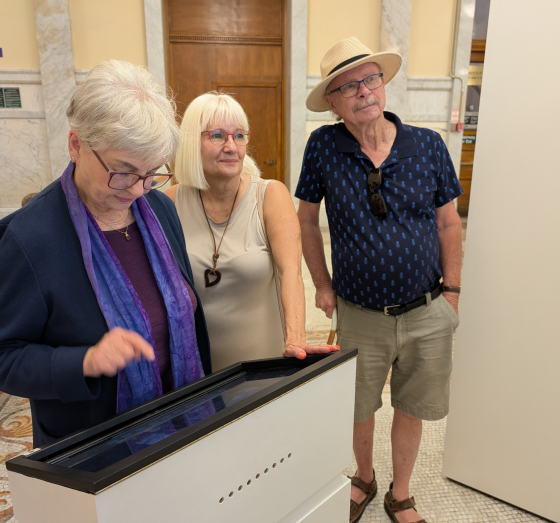
I was able to observe some user behaviours during the first monthlong exhibition, in which there were about 450 responses.
Group Dynamics
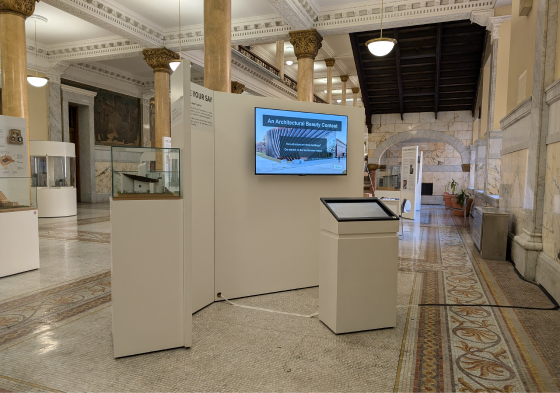
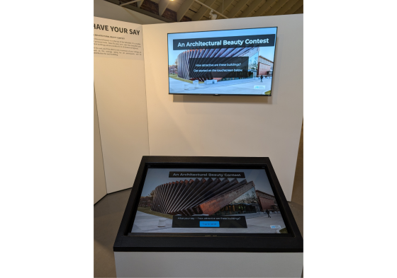
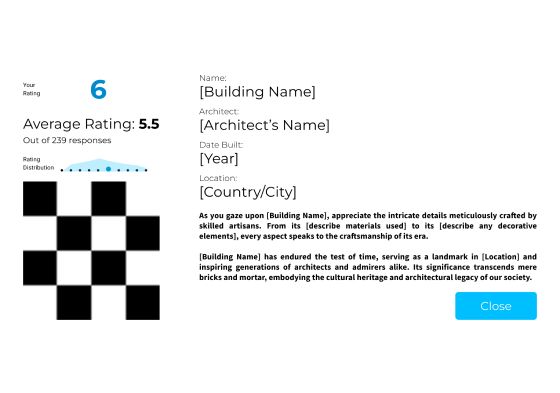
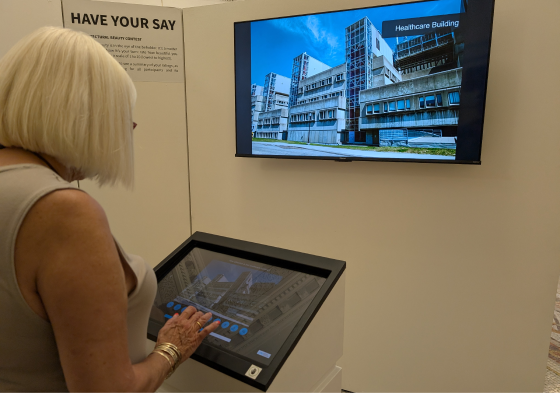
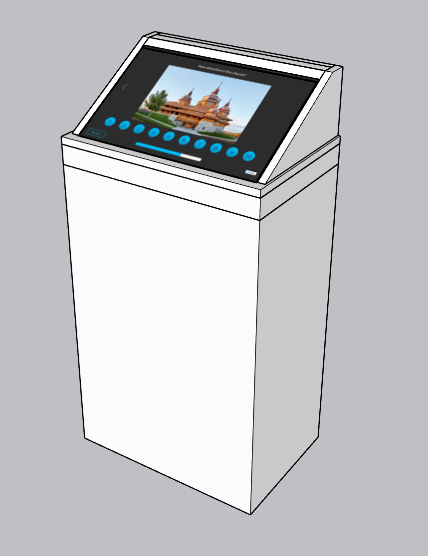
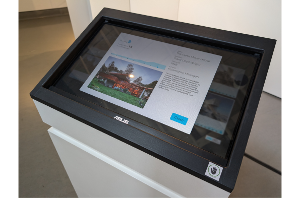
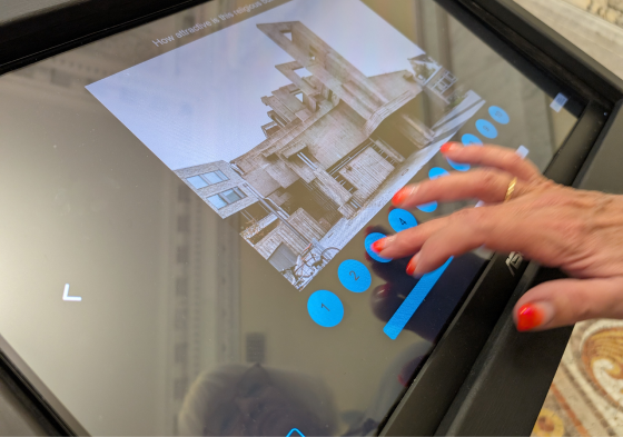
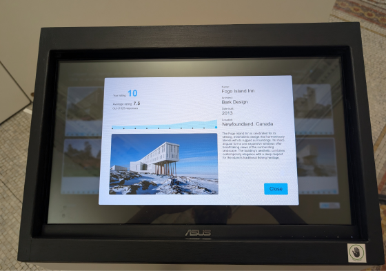
Our assumption that players would use the big screen to look at the buildings in greater detail proved incorrect, as they mostly keep their eyes down on the touchscreen throughout the survey.

However, many people come in groups, and while one person plays the survey, the others usually watch the buildings cycle through on the big screen. Often they provide their opinions as well, which helps turn the experience into a shared one rather than a solitary interactive exhibit.

The large screen also had the effect of catching the attention of other passers-by on the gallery floor and drawing them into the area of the display. So, although the large screen was not used as intended, it did enhance the effectiveness of the experience.
Hidden Prompts

I have found that the few prompts included on the top of the touchscreen are often overlooked by the player, whose eyes are drawn to the images and other more visually stimulating elements on the screen.

This was most relevant on the results page, where they are instructed to select individual cards to view more about them. I found that about 50% of players would never click on the cards and would simply look at the graphs provided on the results page. In future I will try to rework the prompts to be more visible and perhaps more clearly worded.

Users often jump straight to pressing buttons before reading the prompts on screen, which are less attention-grabbing.
By the end of the two month exhibition, over 600 people had tried our survey. It was frequently listed on exit surveys as a favourite display.
Success?
Overall the display seems to have been a success, which I measure by a couple of factors:

The number of responses, and specifically the high percentage of visitors to the gallery who played the survey, suggests that it was an engaging and interesting display.

Our exit survey responses referenced the Aesthetics Survey many times as among visitors’ most favourite display, and an interactive that they would like to see more of.
Plinth Improvements

A few things were noted concerning the plinth construction and computer setup:

The plinth door should have a lock protecting it from tampering, but which is easy enough to unlock for gallery staff to attend to the display at a moment's notice. The PC should be in a kiosk mode, but that proved difficult with this model of mini-PC, and Windows only allows you to use Microsoft apps while in it. I’m sure there are solutions to this but I haven’t found them as yet.

The final physical design. A text label on the display unit introduces visitors to the concept and invites them to play.
The display at Old City Hall, Toronto.
Conclusion
Interactive displays on the museum floor can engage visitors in ways that get them actively thinking about the content at hand. This survey app strives to get visitors to apply the ideas which they’ve previously read about in the exhibit, and I believe that was a large factor in its success. Another reason was the visually stimulating display which facilitated interaction between visitor and content, as well among the visitors themselves, as people playing together would often discuss their tastes regarding architectural attractiveness.

The minimal UI and straightforward design also left little room for misinterpretation and relied heavily on graphic instruction and simple text prompts to explain to users how to play. Some alterations in text prompts are required and will be implemented for the next time the exhibition goes up.