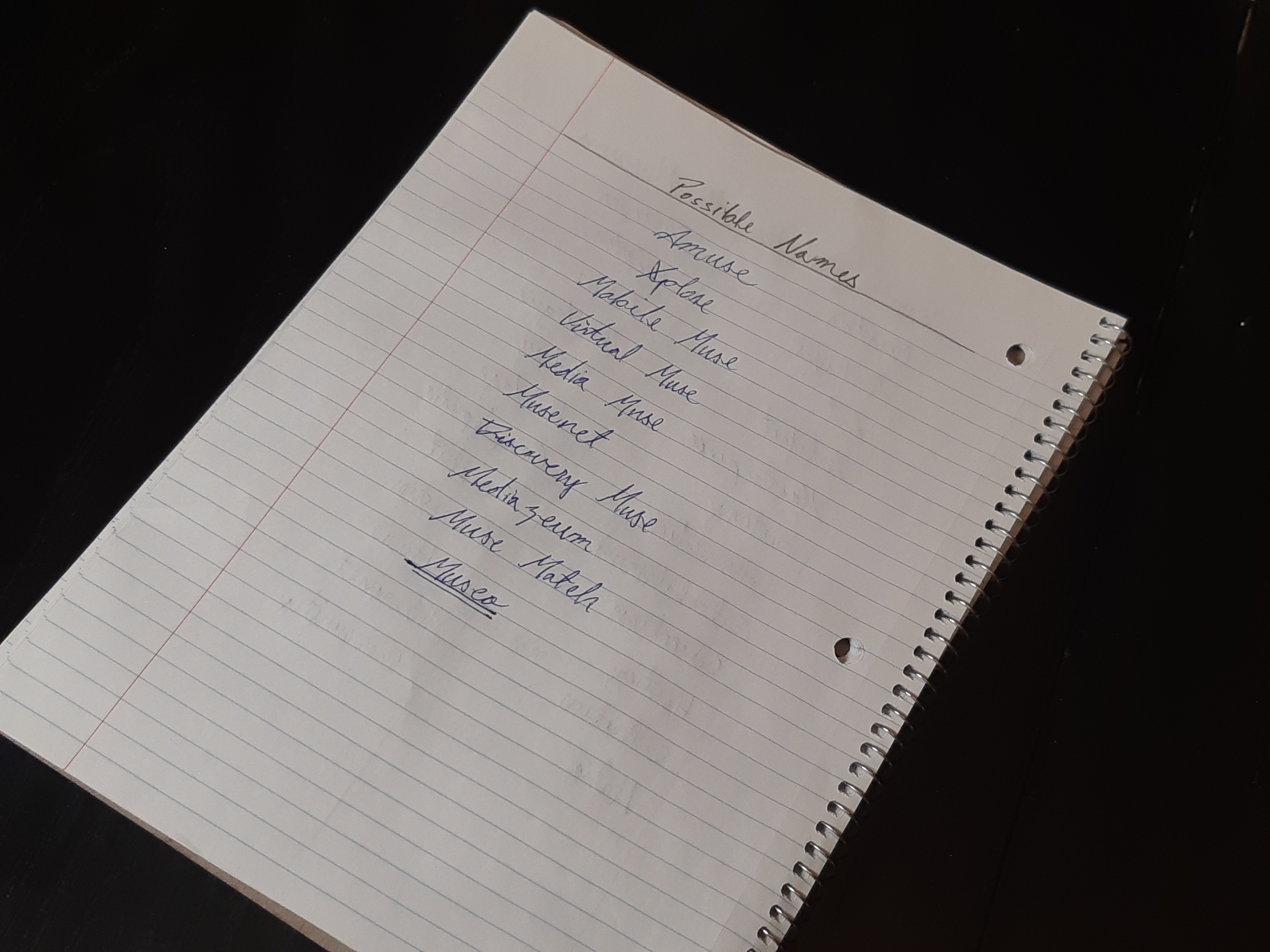
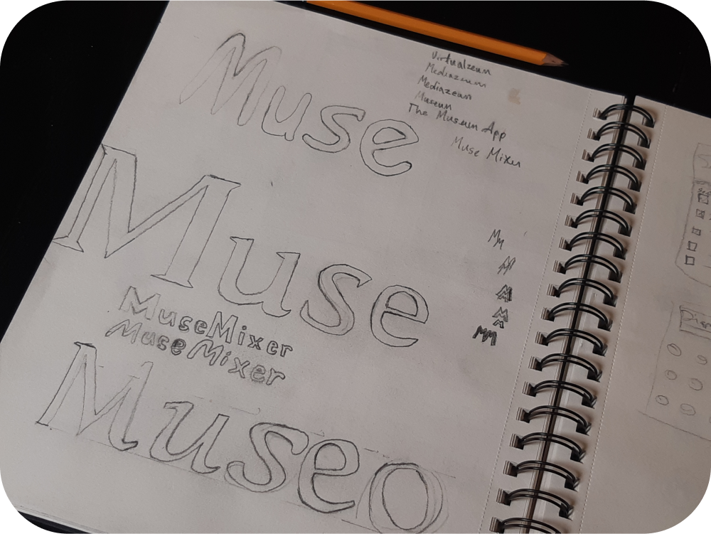
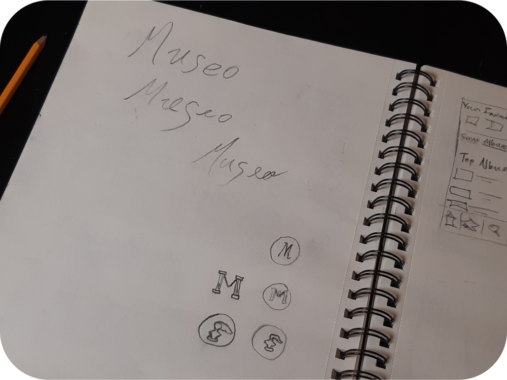
Finding my Museo
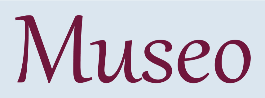
Welcome to my Museo case study. Museo is a virtual museum app I developed for my capstone project as part of BrainStation’s UX Design Bootcamp.
I finished my Masters in Museum Studies in Spring of 2022, and one thing I love about museums are the possibilities for accessible learning via digital solutions.
This project gave me the opportunity to explore the problem space of museum apps.
Please come on a journey with me to see how I got from murky idea to finished prototype.
-Biden


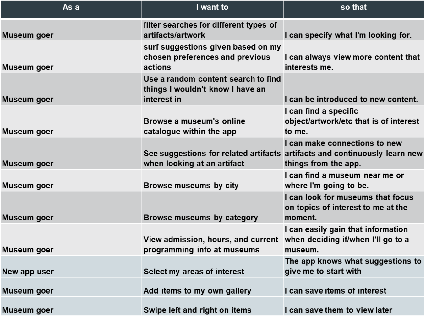
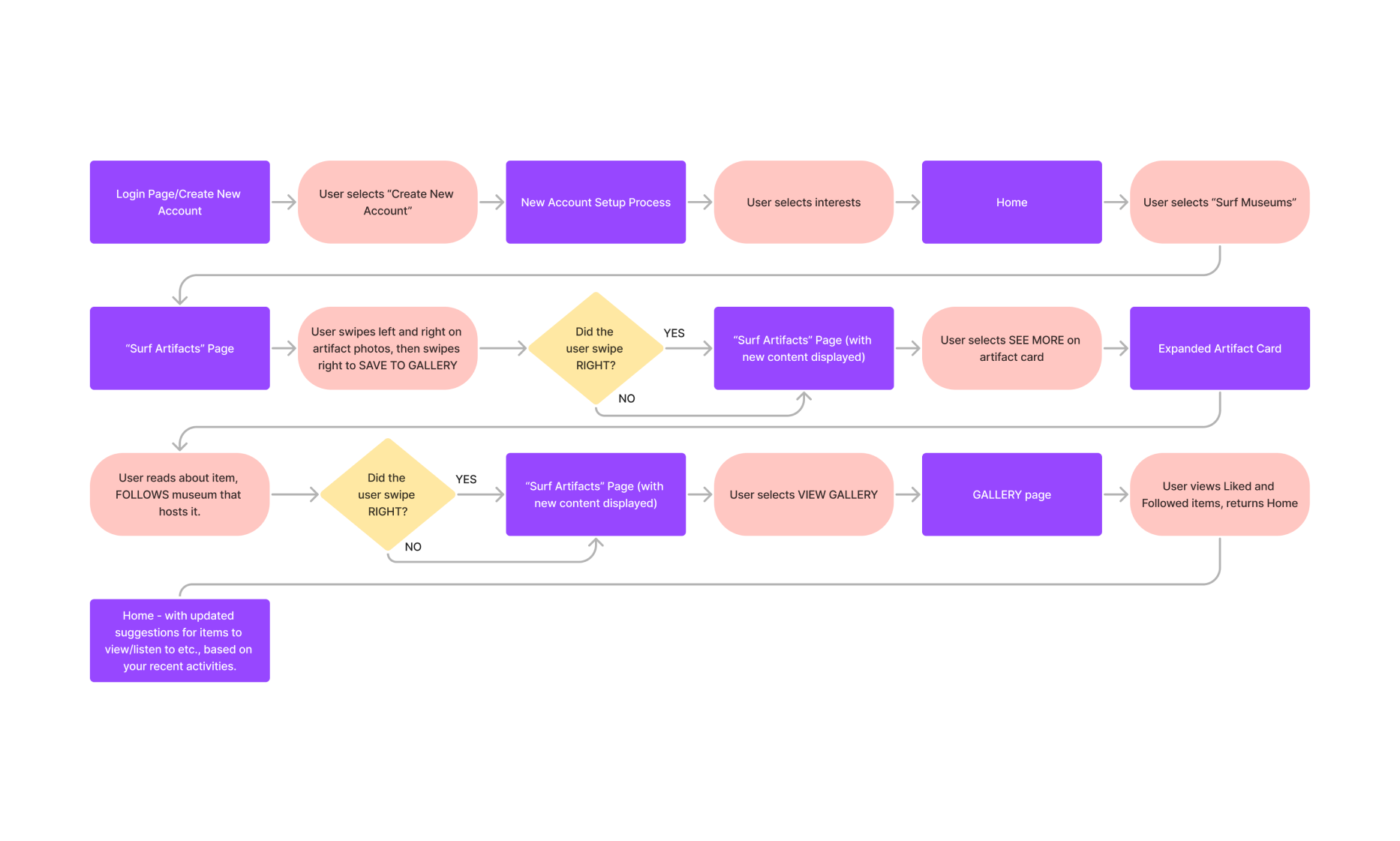
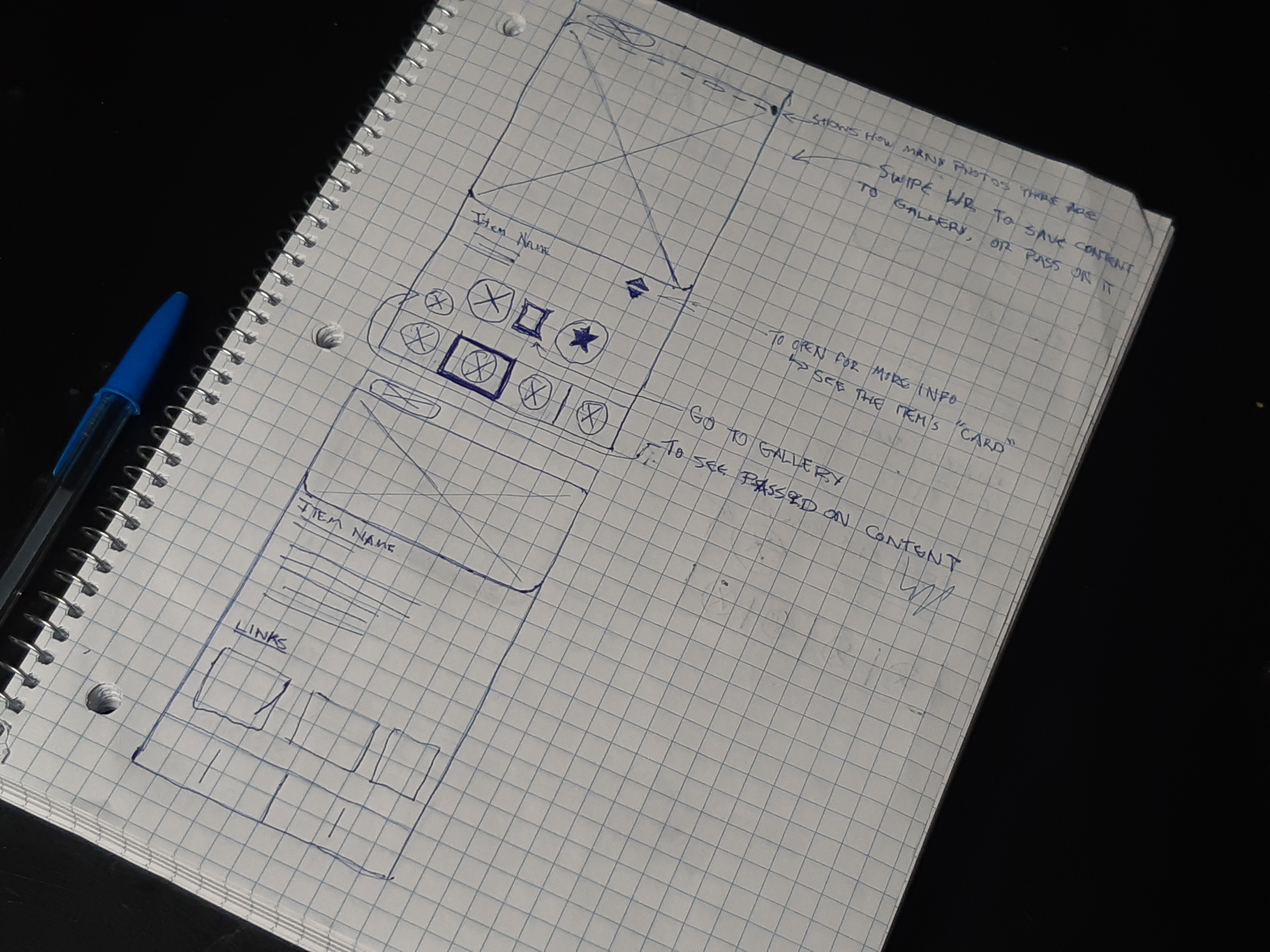
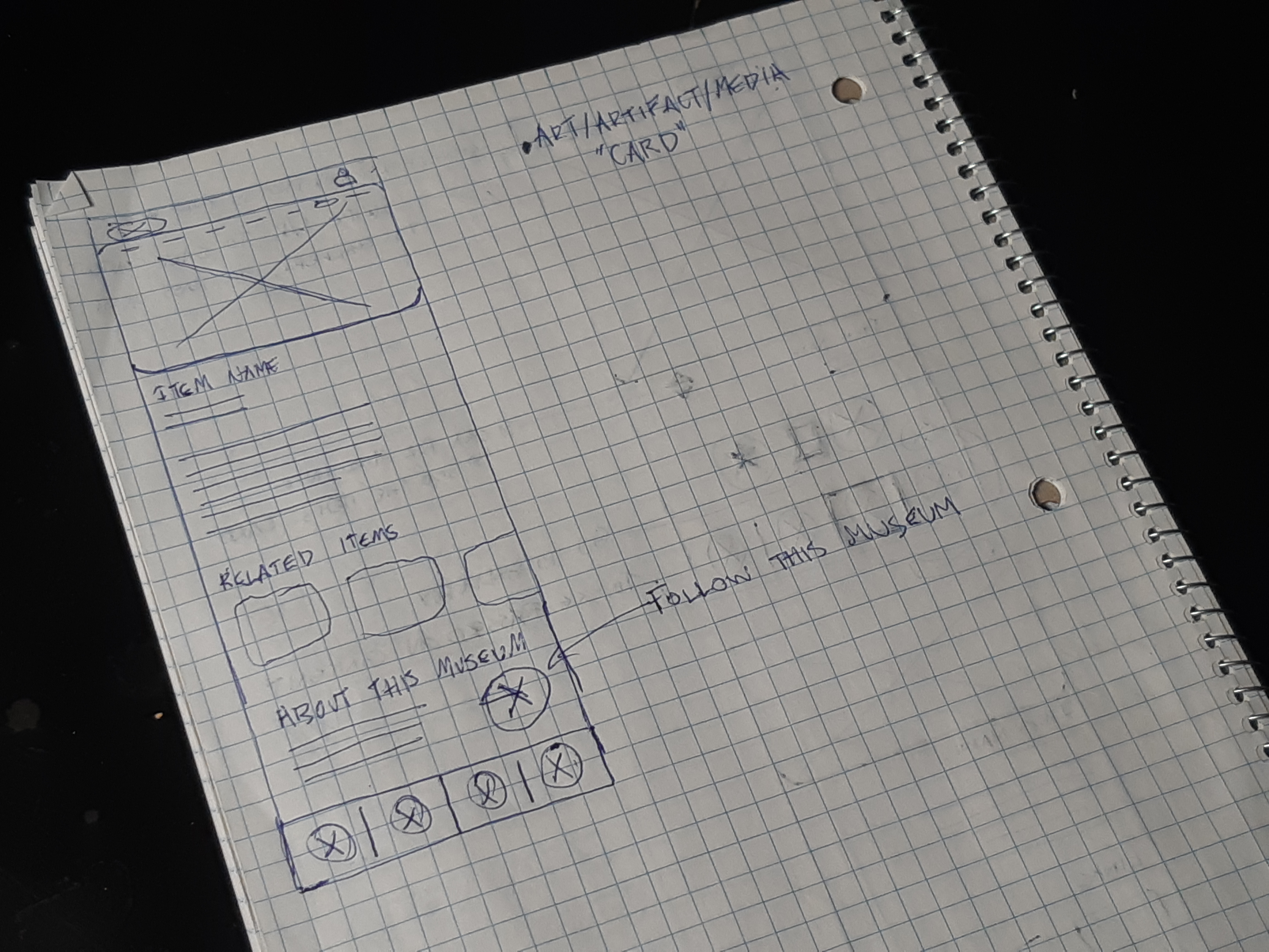
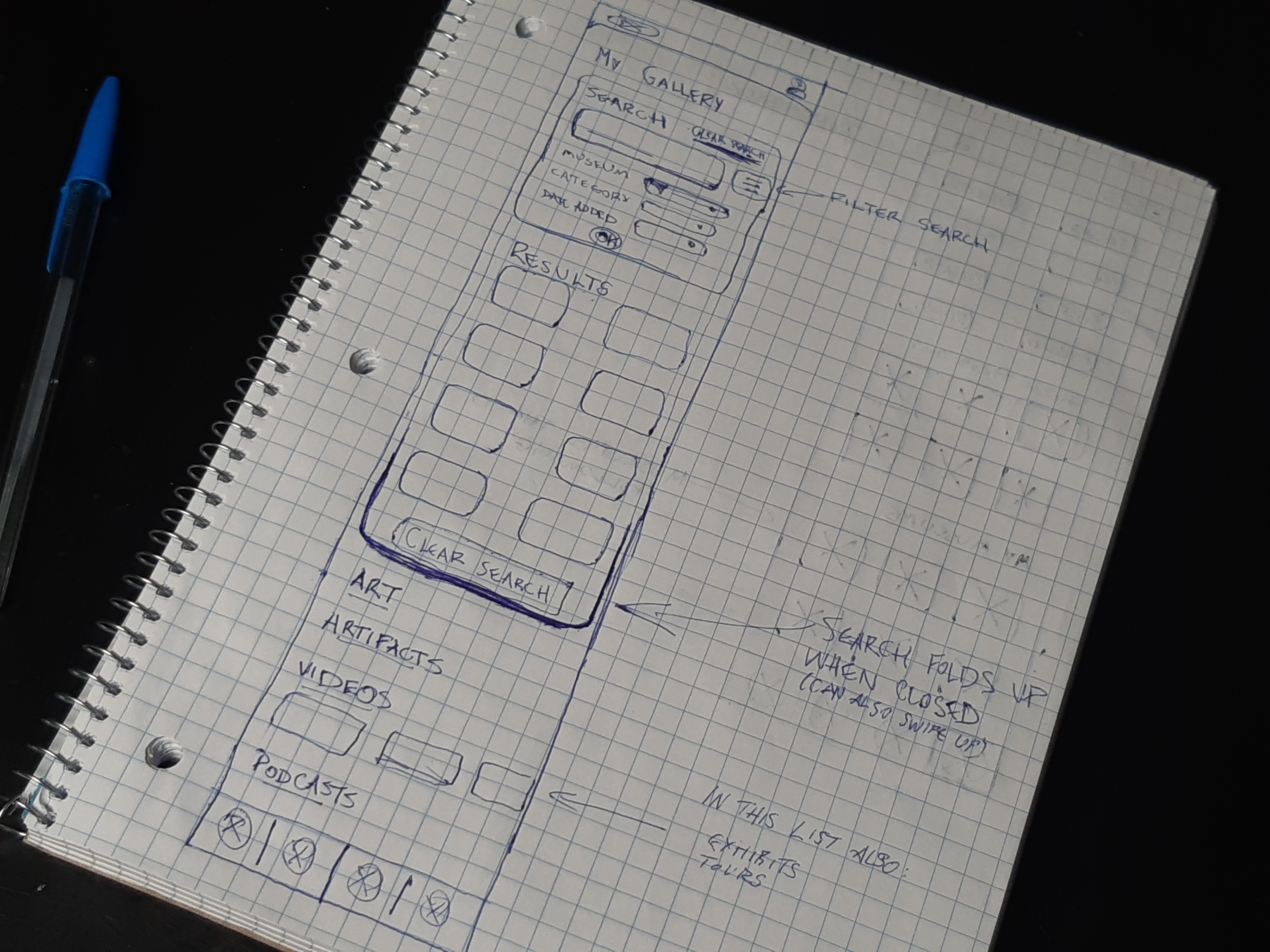
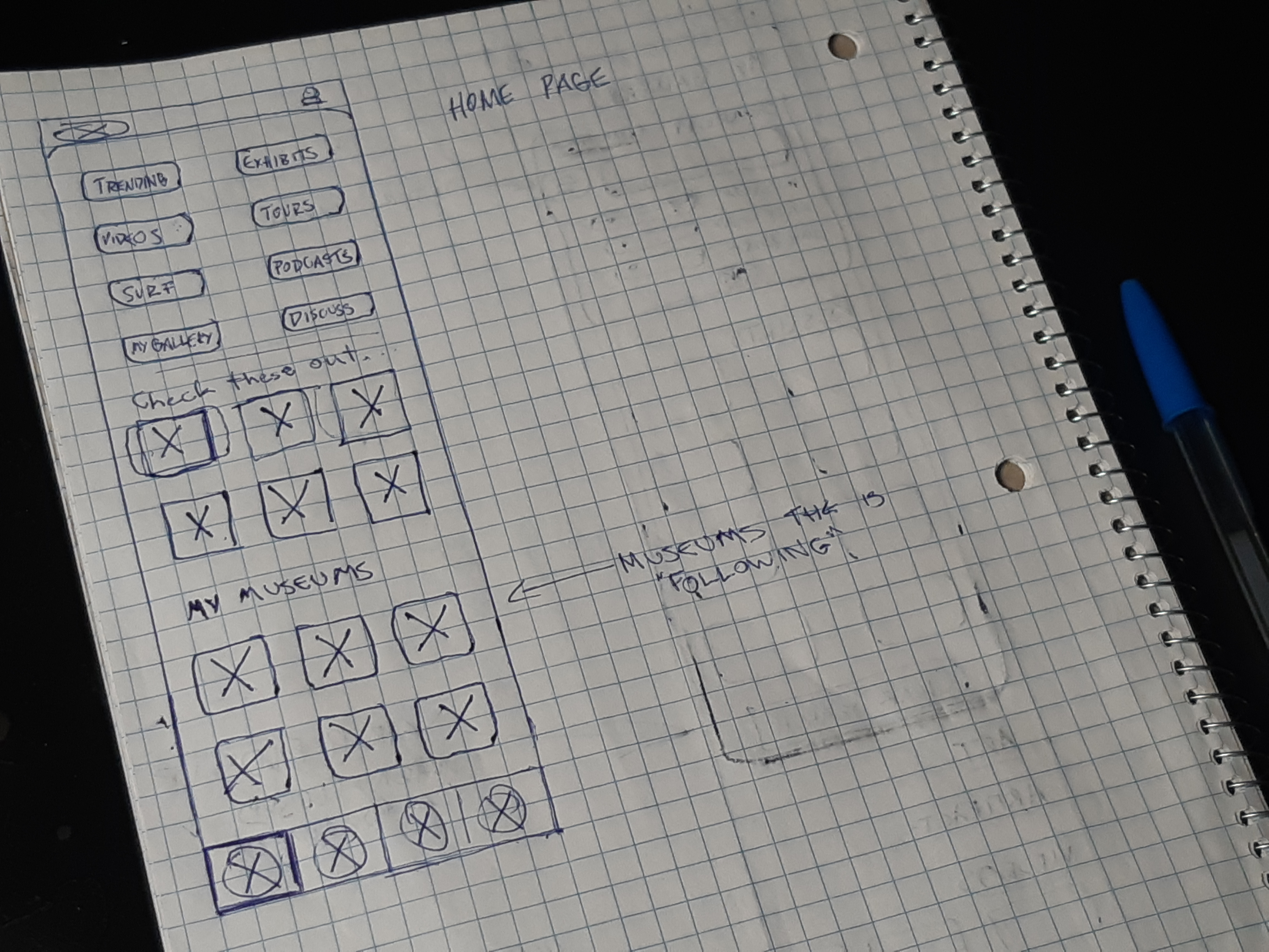
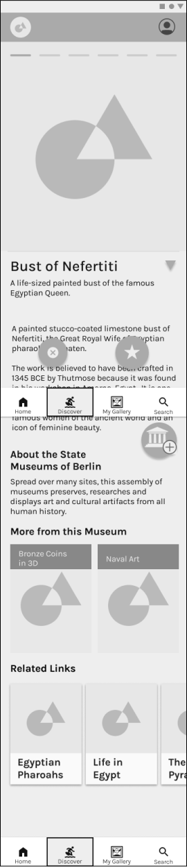
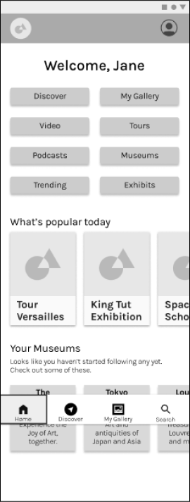
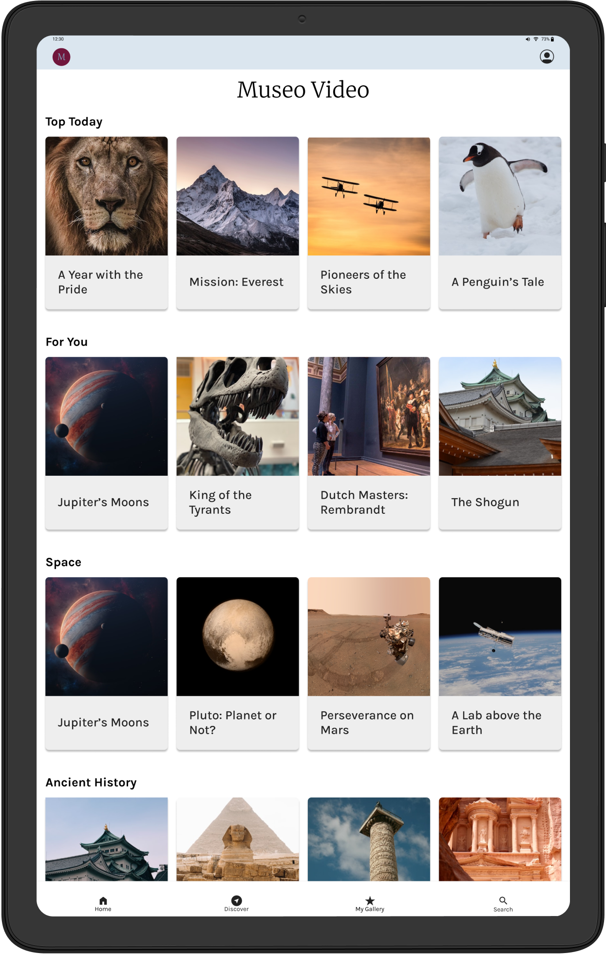
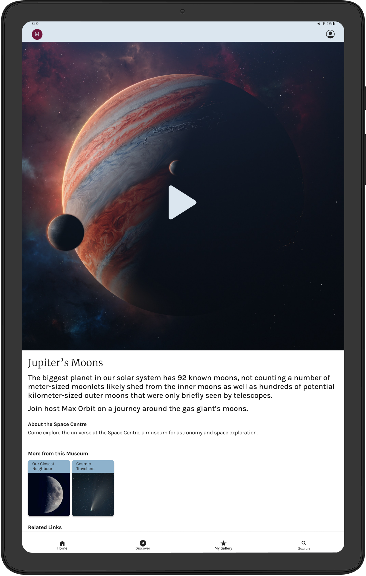
.png)
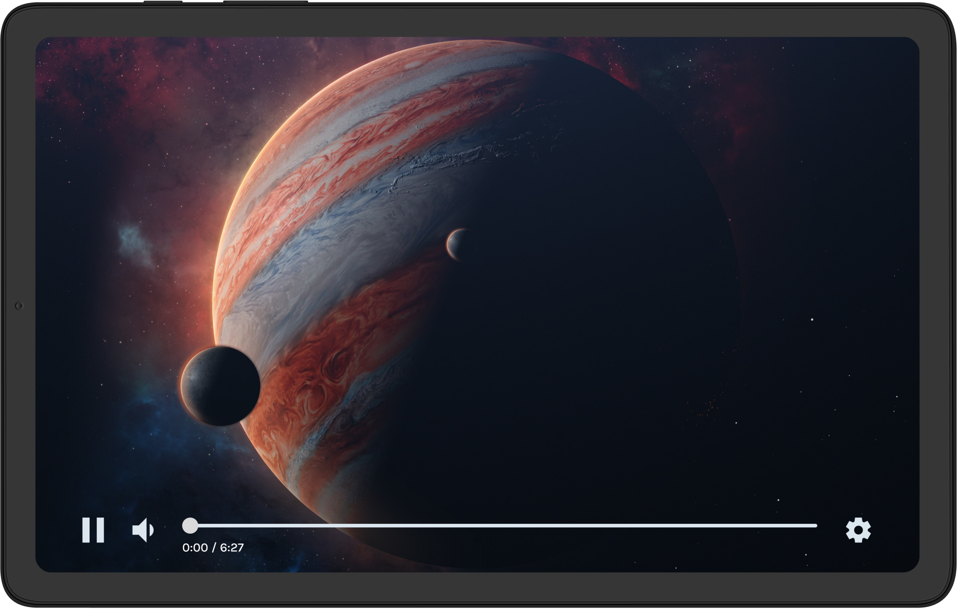
.jpg)