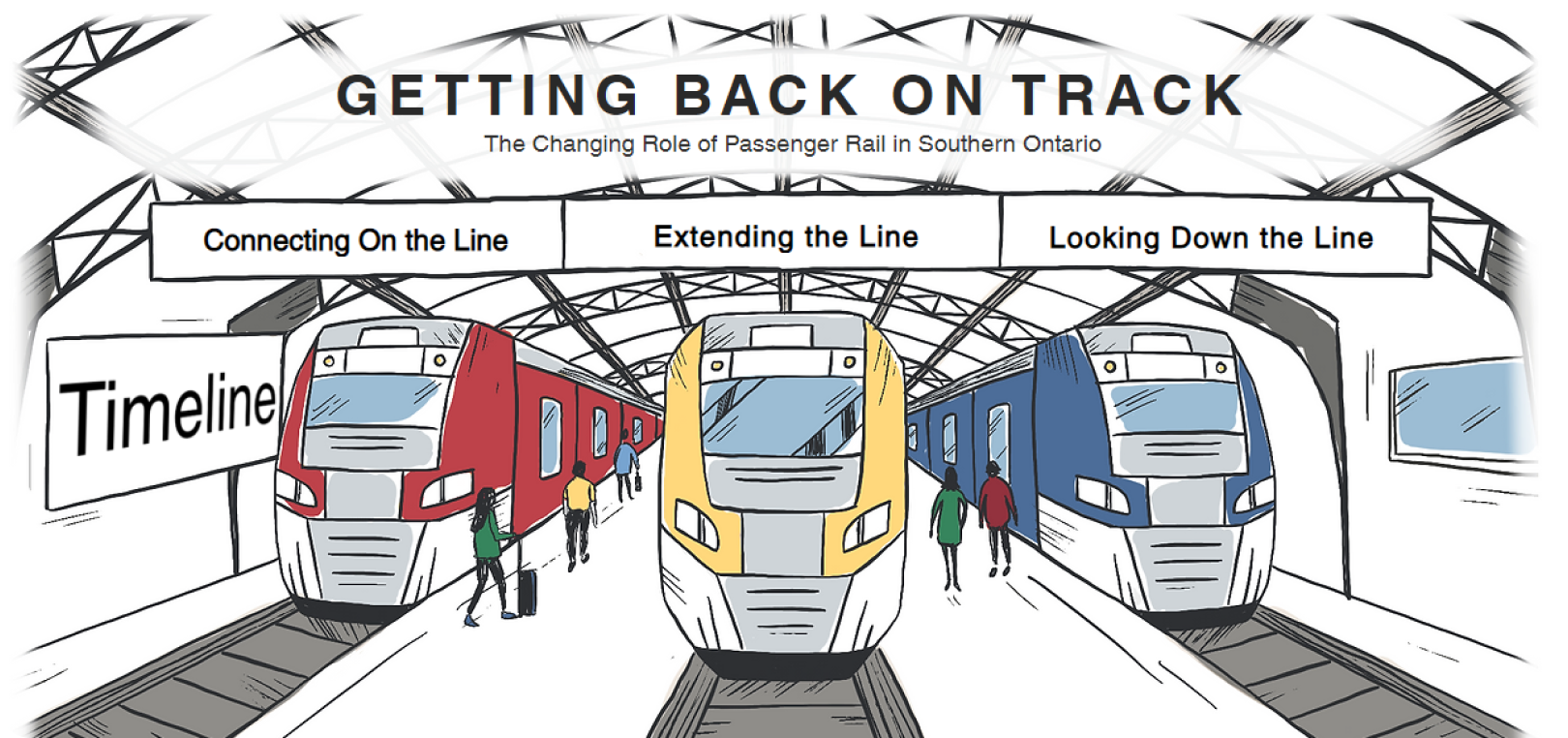
Getting Back on Track
A Case Study
In 2022 I completed my Masters in Museum Studies at the University of Toronto.

My capstone project for that program was to create a virtual exhibition in conjunction with the Toronto Railway Museum (TRM).

Three other classmates and I worked together to develop an experience for users to learn about the changing role of passenger rail in southern Ontario.
Brief
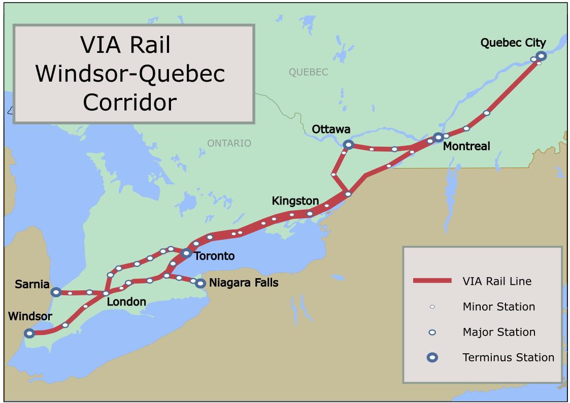
Initially, we were tasked with developing a virtual exhibition on the changing role of passenger rail in Toronto. After a little research, however, along with the TRM we expanded the scope of the project to include all of Southern Ontario. We realised that it was difficult to speak only about Toronto in isolation, when it is part of a rail network that connects much of the province.

We were responsible for determining the stories to focus on, developing and writing a narrative, and designing a website to host the exhibition for one year.
Approach
Early on, we decided on a few key elements for the exhibition:
  • A central component would be collaborating with members of the community who wish to share their stories and experiences.
  • There would be interactive elements. (quizzes, pop-ups, maps, etc.)
  • We wanted to avoid what we saw as a weakness in many virtual exhibitions: monotonous scrolling through a long article-like webpage.
The Structure
We divided the exhibition into 4 distinct sections:
  1. A History timeline which gave visitors a brief overview of the history of Ontario rail in 10 slides from Confederation to the early 2000s.
  2. Connecting on the Line - stories of people’s relationship and personal experience with rail services in Ontario.
  3. Extending the Line - a breakdown of current projects to expand Ontario’s rail services.
  4. Looking down the Line - how communities and developers plan for future growth in Ontario.
Before hiring an artist to illustrate the homepage, we made a rough version of it in Sketchup, and experimented with it would look like at different angles.
We wanted the exhibition to be enjoyable for a broad age group, from schoolkids to a more mature audience, and for that reason we went with a fun, approachable, but not-too-kiddy sort of look.

Once we were happy with the view, we hired an artist to illustrate the home page and other train drawings found throughout the exhibition.
For each of the three “Line” sections, to create a sense of the visitor going on a journey, our top navigation bar became a railway, with each “stop” being a different display. As the visitor progressed through the section, they would see their train move along the track.

Those displays were often centered around a video highlighting responses from our interviewees, and featured interactive elements such as expandable maps and quizzes.
An example of a main content page.
An example of a quiz.
An example of a pop-up.
We wanted the experience to feel relatable for our audience, so the backbone of the exhibition was our 5 interviewees.

They came from across the region and represented a variety of age groups which gave different perspectives on the importance and significance of rail travel in their lives.

To find those interviewees, we ran an initial Google survey, and made it available through Reddit pages and other forums. That way we garnered many responses that made their way into the exhibition, and we selected 5 individuals who indicated their interest in taking part in the interviews.
One particular part I contributed to (and had a lot of fun with) were maps that were spaced throughout the exhibition.

They gave visitors extra information about additions to routes.

For me, the beauty of maps is their ability to pack in a lot of information in a single image than what can be communicated solely through words.
How a typical map page looks.
For most of the maps, I traced over existing ones made publicly available by GO Transit and Via Rail.

I made decisions as to what to highlight, such as stations and routes.

In some cases, I combined information from various sources to communicate in one image.
Conclusion and Key Learnings
Thanks for taking a tour with me through some of the highlights and process of this exhibition. Looking back on it, I learned a few important things through this process:
  1. Design is an iterative process that takes multiple revisions before finding the best solution.
  2. A good project manager is key in collaborative, complex projects.
  3. Audiences want to have their say.